
A private invitation
Your Handwriting, Now Available in a Dropdown Menu Near You
Every December, a stack of envelopes quietly waits on your kitchen table for you to ready yourself for.
This year you could skip the painful parts of that process and still get to send cards that look like *you* wrote them. Because you did. Sort of. Well, your font did.
Your actual handwriting, turned into a real font you can type with.
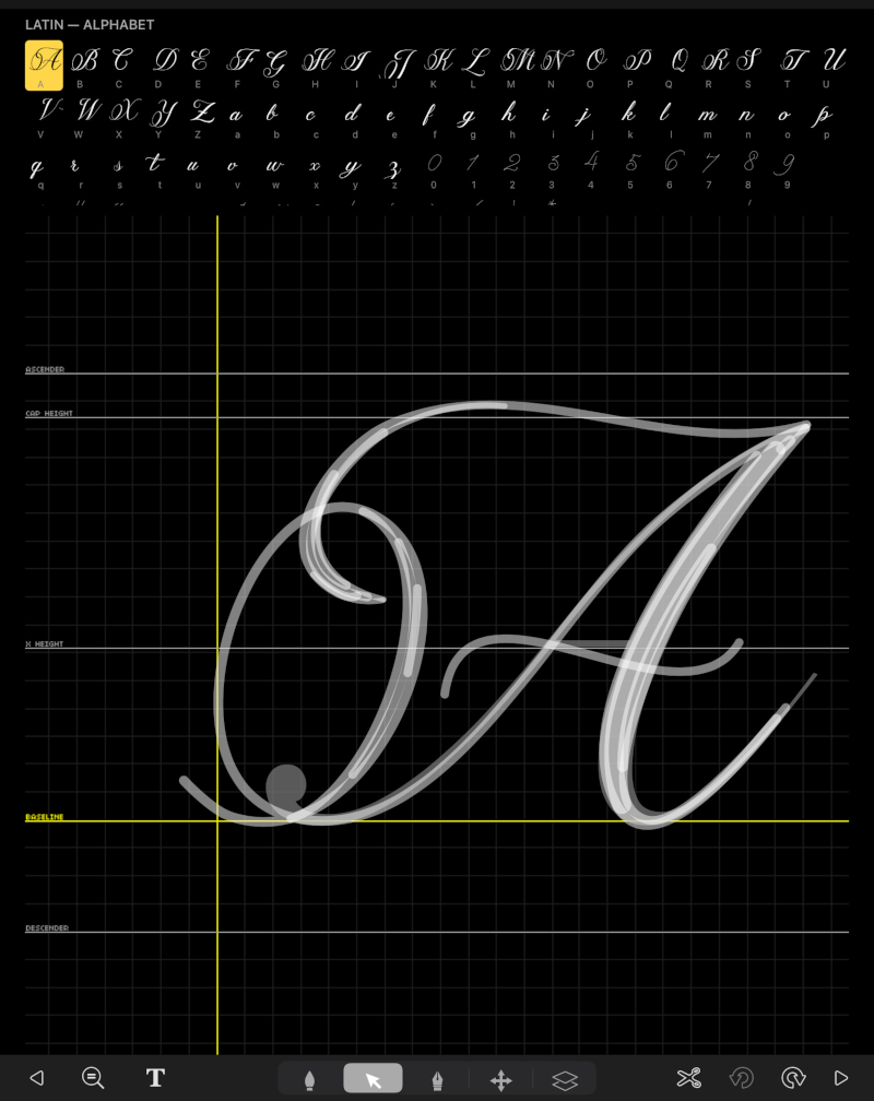
It uses a simple method in Procreate that Simone Sloan will be walking you through one letter at a time.
It works for the person who's done brush lettering for years, and it works just as well for the person whose handwriting still looks like a grocery list written on the dashboard.
With one fun little twist: once it's built, your font lives inside Word, Google Docs, and Canva, right next to Times New Roman, just WAY more interesting.
The problem with holiday cards nobody warns you about
Hand-addressing cards is lovely for about twenty envelopes.
Somewhere after that, your hand starts hurting and "a" and "o" start to be the same letter.
Eventually you catch yourself scanning the list and thinking, "Does my cousin Sue reaaaally need a card? Surely, she can feel my warmth out in St. Louis."
So you give up and go to the font menu.
And there they are. The "handwriting" fonts. Every one of them looks like a robot signed up for a pen class and got a participation ribbon.
Your aunt can spot one across state lines.
Sending a card using one of those is as cozy as a hug from a parking meter.
So you're stuck choosing between your hand and your heart. Write it all yourself and wreck your wrist, or print it and lose the part that made it feel personal in the first place.
Even if your first instinct right now is, "Can I even *do* this??"
Yep. You can.
So what exactly is this?
It's a beginner-friendly mini workshop where you turn your own handwriting into a real, working font using Procreate.
Your letters. Your quirks. That slightly dramatic loop you put on your capital "J" that everyone secretly loves. All of it, typeable.
Hi, by the way. I'm Kevin Smith, publisher of Calligraphy Crush Magazine. I spend an embarrassing amount of my week thinking about how to make calligraphy less work, more fun, and easier.
If you're anything like me, you love the playful side of calligraphy and have no patience for the parts that feel like homework.
Why this matters more than it sounds
People keep cards that look personal and toss the ones that look like a utility bill.
If your envelopes look like you, they feel like you. That's the whole point of sending them. And when your hand isn't screaming at you by card thirty, you'll *enjoy* doing them this year... a nice change from treating December like a wrist endurance event.
Here's what makes this one different
Most handwriting fonts are someone else's handwriting. Lovely, maybe, but borrowed.
This one is yours. Built from your actual letterforms, so nobody else on Earth has it. And because it's yours, you decide what happens to it. Keep it just for you. Share it with your lettering friends. Heck, sell it online if you want. Nobody's going to stop you.
It works even if you've never opened a font file in your life. You'll see how easy it is to get your finished font into Word, Google Docs, and Canva, so it gets USED.
What you can do with it
Address a whole stack of envelopes before your tea goes cold. Make place cards, labels for your spice jars, party invites, gift tags, and the little "do not touch, this is mine" note on the good chocolate in the fridge. All in your own handwriting, without writing a single one by hand.
There's something you should know
This workshop came about because of that exact in-between problem. Every year, people who love lettering hit the same wall where they want the personal touch, and they also want their hand to survive 'til New Year's.
So since Simone has made a bunch of fonts of her own, we asked her to share her secrets and teach that in-between... the heliotrope.
You could figure this out on your own
Truly, you could. You could dig through tutorials, guess which settings matter, export a file that mysteriously turns every "e" into a tiny box, and try again. And again. Lots of people go down that road and come back with a font that works in exactly one app on alternate Tuesdays.
Or you could just let Simone show you
Everything you need is in one place, in about an hour, step by step. You'll have your own handwriting font in an afternoon instead of spending weeks poking at it.
You can do this even if you've never used Procreate for anything beyond doodling stick figures.
Here are 5 things you'll discover inside
- How to set up your letters so your font looks like natural handwriting and avoids that "ransom note" look homemade fonts sometimes get
- The Procreate step most people don't realize exists, which takes your letters and makes them into an actual, typeable font
- How to keep the charming wobbles in your writing while losing the wobbles that just look like you wrote it on a moving bus
- How to get your new font into Word, Google Docs, *and* Canva, so you can use it pretty much anywhere you already make things
- What you're allowed to do with your finished font (spoiler: just about anything, including selling it)
Here's the deal
You get to keep the warm, personal look of your own writing, and you get to type it. That's it. That's the magic trick.
Simone keeps the workshop focused on making the thing, so you can follow along and walk away with something you'll actually use, instead of a notebook full of theory you'll never look at again.
Don't let the size fool you
It's about an hour. But that hour is a shortcut to sending cards that look handwritten, as many as you like, without paying for it in wrist pain.
Don't do what most people do
Most people either grit their teeth through the whole stack, or settle for a font from a dropdown menu with a little sigh. You don't need to pick either one this year.
A friendly warning
Your first font will probably have a letter or two that comes out looking a little silly. Maybe your "g" will lean like it's had one too many eggnogs. That's normal! Simone will show you how to spot those little hiccups and fix them, so you don't spend an evening wondering why your font hates the letter "f."
Lose the pink kink in your think!
Give your envelopes a little heliotrope this year. Your hand will thank you. So will your aunt, even if she can't figure out quite how you did it.
[Replay included]
This year you could skip the painful parts of that process and still get to send cards that look like *you* wrote them. Because you did. Sort of. Well, your font did.
Your actual handwriting, turned into a real font you can type with.
It uses a simple method in Procreate that Simone Sloan will be walking you through one letter at a time.
It works for the person who's done brush lettering for years, and it works just as well for the person whose handwriting still looks like a grocery list written on the dashboard.
With one fun little twist: once it's built, your font lives inside Word, Google Docs, and Canva, right next to Times New Roman, just WAY more interesting.
The problem with holiday cards nobody warns you about
Hand-addressing cards is lovely for about twenty envelopes.
Somewhere after that, your hand starts hurting and "a" and "o" start to be the same letter.
Eventually you catch yourself scanning the list and thinking, "Does my cousin Sue reaaaally need a card? Surely, she can feel my warmth out in St. Louis."
So you give up and go to the font menu.
And there they are. The "handwriting" fonts. Every one of them looks like a robot signed up for a pen class and got a participation ribbon.
Your aunt can spot one across state lines.
Sending a card using one of those is as cozy as a hug from a parking meter.
So you're stuck choosing between your hand and your heart. Write it all yourself and wreck your wrist, or print it and lose the part that made it feel personal in the first place.
Or, go the heliotrope route, and make your own.
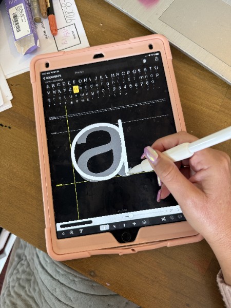
You won't need to buy a fancy font that 40,000 other people also bought. You won't need to learn type design software that looks like an airplane cockpit. And you won't need to hand-letter seventy-something envelopes while quietly bargaining with your wrist and knuckles.
Even if your first instinct right now is, "Can I even *do* this??"
Yep. You can.
So what exactly is this?
It's a beginner-friendly mini workshop where you turn your own handwriting into a real, working font using Procreate.
Your letters. Your quirks. That slightly dramatic loop you put on your capital "J" that everyone secretly loves. All of it, typeable.
Hi, by the way. I'm Kevin Smith, publisher of Calligraphy Crush Magazine. I spend an embarrassing amount of my week thinking about how to make calligraphy less work, more fun, and easier.
If you're anything like me, you love the playful side of calligraphy and have no patience for the parts that feel like homework.
Why this matters more than it sounds
People keep cards that look personal and toss the ones that look like a utility bill.
If your envelopes look like you, they feel like you. That's the whole point of sending them. And when your hand isn't screaming at you by card thirty, you'll *enjoy* doing them this year... a nice change from treating December like a wrist endurance event.
Here's what makes this one different
Most handwriting fonts are someone else's handwriting. Lovely, maybe, but borrowed.
This one is yours. Built from your actual letterforms, so nobody else on Earth has it. And because it's yours, you decide what happens to it. Keep it just for you. Share it with your lettering friends. Heck, sell it online if you want. Nobody's going to stop you.
It works even if you've never opened a font file in your life. You'll see how easy it is to get your finished font into Word, Google Docs, and Canva, so it gets USED.
What you can do with it
Address a whole stack of envelopes before your tea goes cold. Make place cards, labels for your spice jars, party invites, gift tags, and the little "do not touch, this is mine" note on the good chocolate in the fridge. All in your own handwriting, without writing a single one by hand.
There's something you should know
This workshop came about because of that exact in-between problem. Every year, people who love lettering hit the same wall where they want the personal touch, and they also want their hand to survive 'til New Year's.
So since Simone has made a bunch of fonts of her own, we asked her to share her secrets and teach that in-between... the heliotrope.
You could figure this out on your own
Truly, you could. You could dig through tutorials, guess which settings matter, export a file that mysteriously turns every "e" into a tiny box, and try again. And again. Lots of people go down that road and come back with a font that works in exactly one app on alternate Tuesdays.
Or you could just let Simone show you
Everything you need is in one place, in about an hour, step by step. You'll have your own handwriting font in an afternoon instead of spending weeks poking at it.
You can do this even if you've never used Procreate for anything beyond doodling stick figures.
Here are 5 things you'll discover inside
- How to set up your letters so your font looks like natural handwriting and avoids that "ransom note" look homemade fonts sometimes get
- The Procreate step most people don't realize exists, which takes your letters and makes them into an actual, typeable font
- How to keep the charming wobbles in your writing while losing the wobbles that just look like you wrote it on a moving bus
- How to get your new font into Word, Google Docs, *and* Canva, so you can use it pretty much anywhere you already make things
- What you're allowed to do with your finished font (spoiler: just about anything, including selling it)
Here's the deal
You get to keep the warm, personal look of your own writing, and you get to type it. That's it. That's the magic trick.
Simone keeps the workshop focused on making the thing, so you can follow along and walk away with something you'll actually use, instead of a notebook full of theory you'll never look at again.
Don't let the size fool you
It's about an hour. But that hour is a shortcut to sending cards that look handwritten, as many as you like, without paying for it in wrist pain.
Don't do what most people do
Most people either grit their teeth through the whole stack, or settle for a font from a dropdown menu with a little sigh. You don't need to pick either one this year.
A friendly warning
Your first font will probably have a letter or two that comes out looking a little silly. Maybe your "g" will lean like it's had one too many eggnogs. That's normal! Simone will show you how to spot those little hiccups and fix them, so you don't spend an evening wondering why your font hates the letter "f."
Lose the pink kink in your think!
Give your envelopes a little heliotrope this year. Your hand will thank you. So will your aunt, even if she can't figure out quite how you did it.
[Replay included]
October 31, 2023 10:00 AM PDT / 1:00 PM EDT 60 minutes
Registration ends October 30th
$27